Salon Suites
September 2024
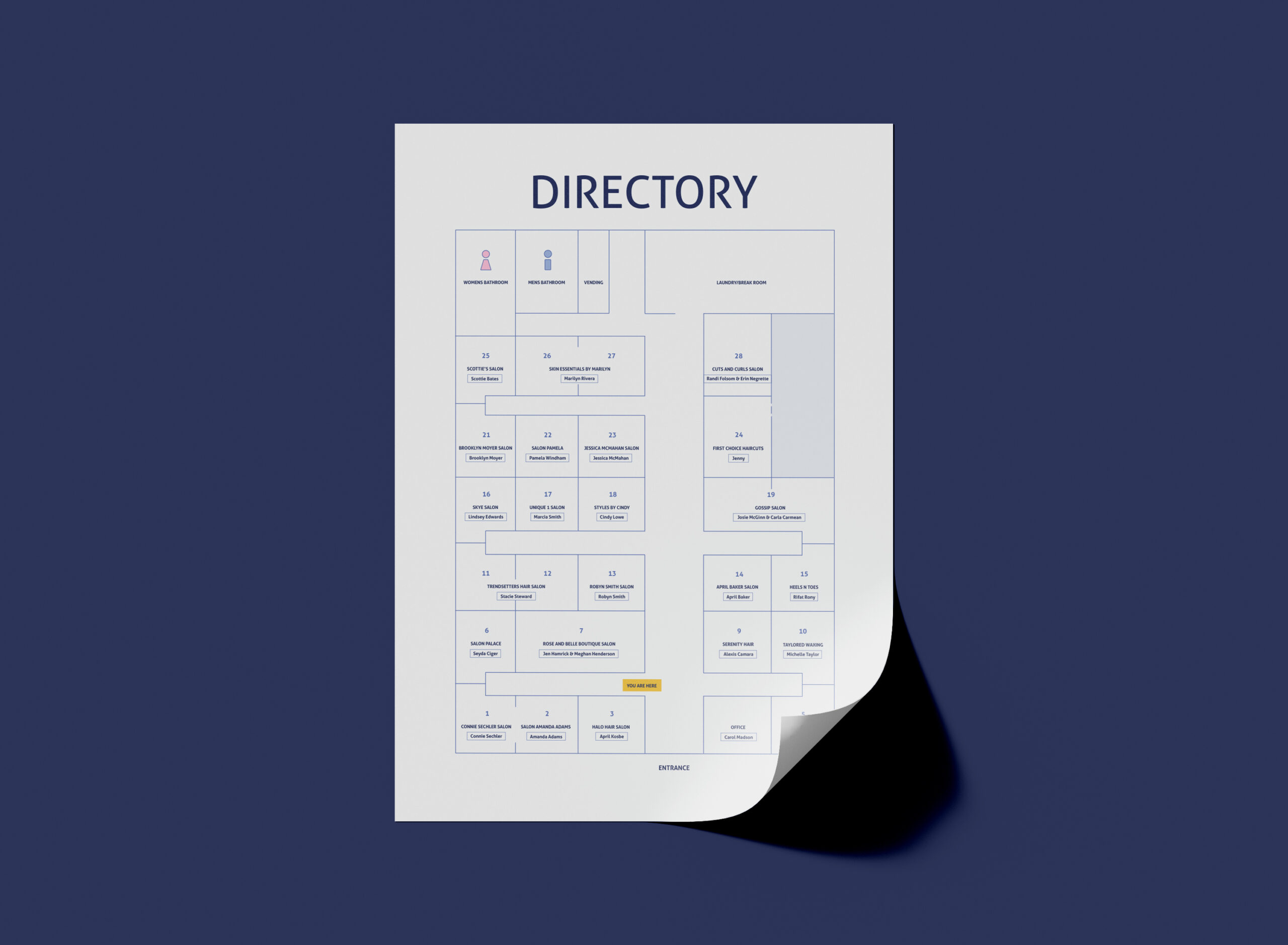
Salon Suites is a business that leases out suites to professionals in cosmetology. They manage the property for guest relations, upkeep, and appearance, which gives business owners greater flexibility and freedom.
Salon Suites came to me seeking a refreshed visual identity. They felt their logo was outdated and did not accurately represent their brand. So, I created a refreshed identity that reflects the salon’s personality and values to better connect with their audience and stand out from competitors.
Salon Suites came to me seeking a refreshed visual identity. They felt their logo was outdated and did not accurately represent their brand. So, I created a refreshed identity that reflects the salon’s personality and values to better connect with their audience and stand out from competitors.
Original Salon Suites logo
Original logo for Facebook profile picture
Salon Suites began as part of a franchise but eventually separated. They wanted a new look that was not old, outdated, or cliché. It was also important that the logo did not feature any symbols relating to hair or hair styling. The client wanted the logo to reflect the variety of beauty services offered at the salon because it is often misconstrued that they only have hairstylists.
After sorting out the client’s wants and needs and their vision, I began researching competitors and creating a plan to move forward.
After sorting out the client’s wants and needs and their vision, I began researching competitors and creating a plan to move forward.
Salon Suites described their personality as friendly, boutique, and clean. They value professionalism, flexibility, and creativity. Flexibility was emphasized as their main selling point compared to traditional salons.
I chose Reina Neue as the primary typeface for the logo because of its friendly letterforms and subtle flare. The slight weight variation in the forms and the ball terminal in the “S” gave off a boutique and creative vibe.
I chose Reina Neue as the primary typeface for the logo because of its friendly letterforms and subtle flare. The slight weight variation in the forms and the ball terminal in the “S” gave off a boutique and creative vibe.
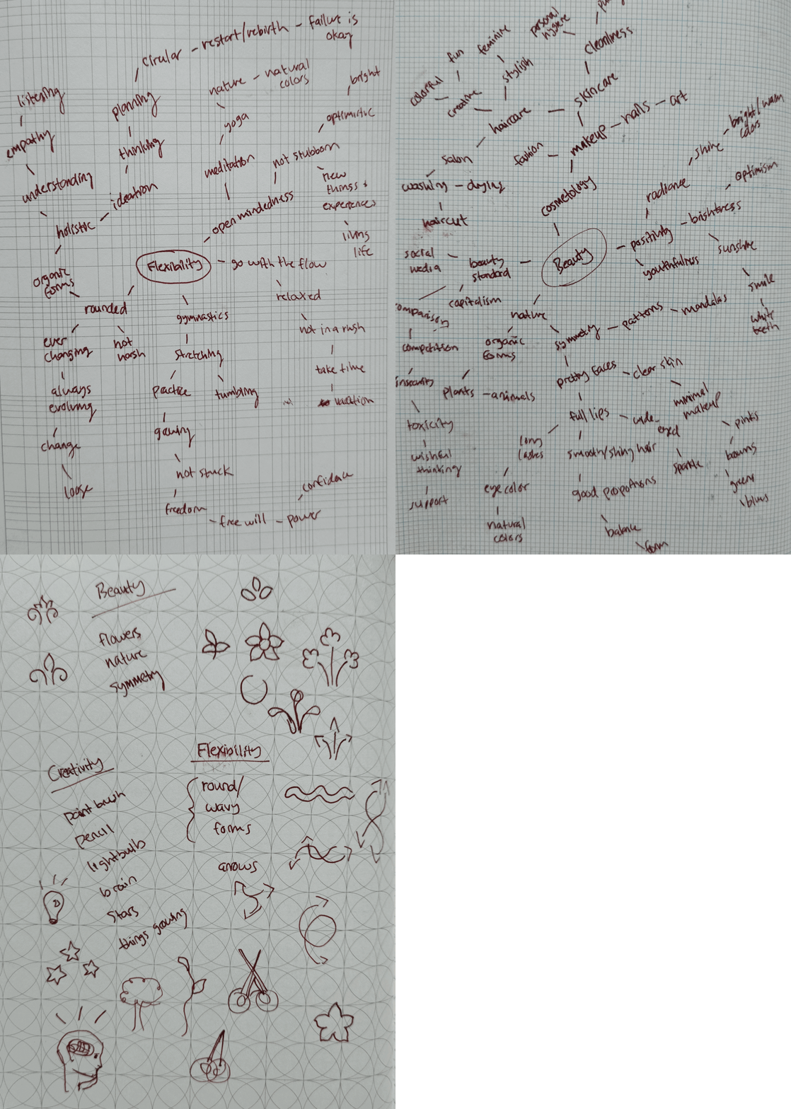
Brainstorming sketches and mind maps
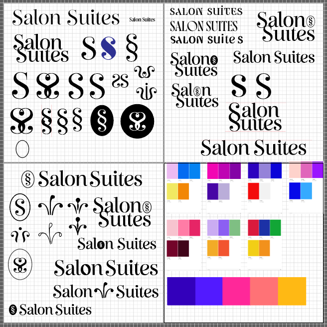
Logo variation ideas and color experiments
Once the primary typeface was chosen, I began working on the logo designs. I decided to combine flexibility and beauty because the salon emphasized flexibility and wanted to advertise a range of beauty services.
After brainstorming and researching, I discovered that beautiful things are often symmetrical. I also found many symbols of intertwining lines and arrows representing flexibility. So, I combined these two ideas to create the logo variations.
After brainstorming and researching, I discovered that beautiful things are often symmetrical. I also found many symbols of intertwining lines and arrows representing flexibility. So, I combined these two ideas to create the logo variations.
After completing the logo designs, I chose a complementary typeface for Reina Neue and a color palette. The client originally asked for bright colors, but then decided on a more mature palette with navy blue as the primary color.
Final logo mark
Final Work
© ELLEN MADSON 2023
