Mapping Out Accessibility
October 2023-November 2023
Mapping Out Accessibility is a continuation of my previous project, Navigating The High Museum of Art. My main goal for this project was to create an app prototype for the blind or visually impaired (BVI) that could be used to navigate the main lobby of the High Museum.
The project required at least four participants and at least six co-design methods with the final deliverable being an 18×24″ foldable poster.
The project required at least four participants and at least six co-design methods with the final deliverable being an 18×24″ foldable poster.
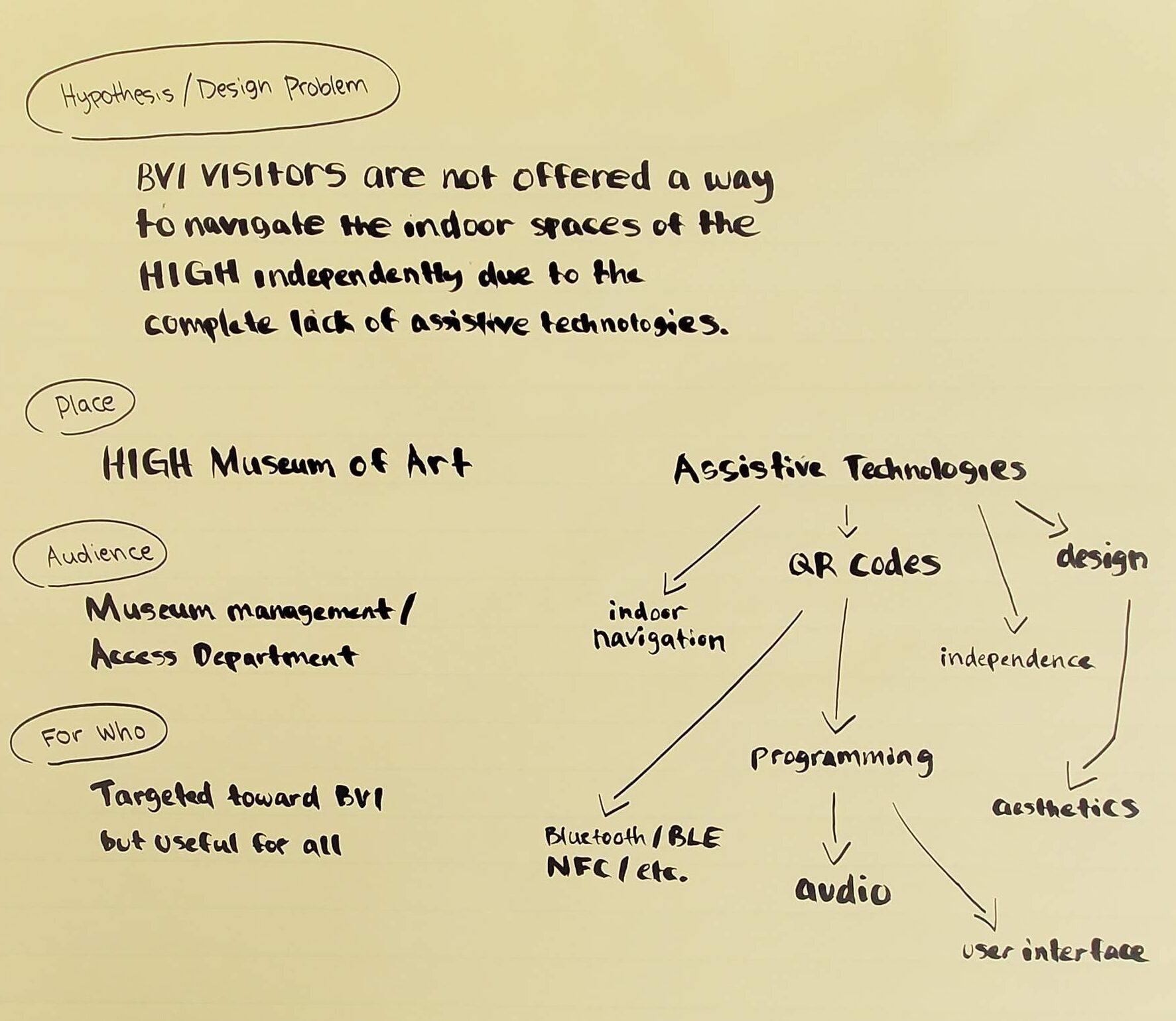
Domain mapping sketch
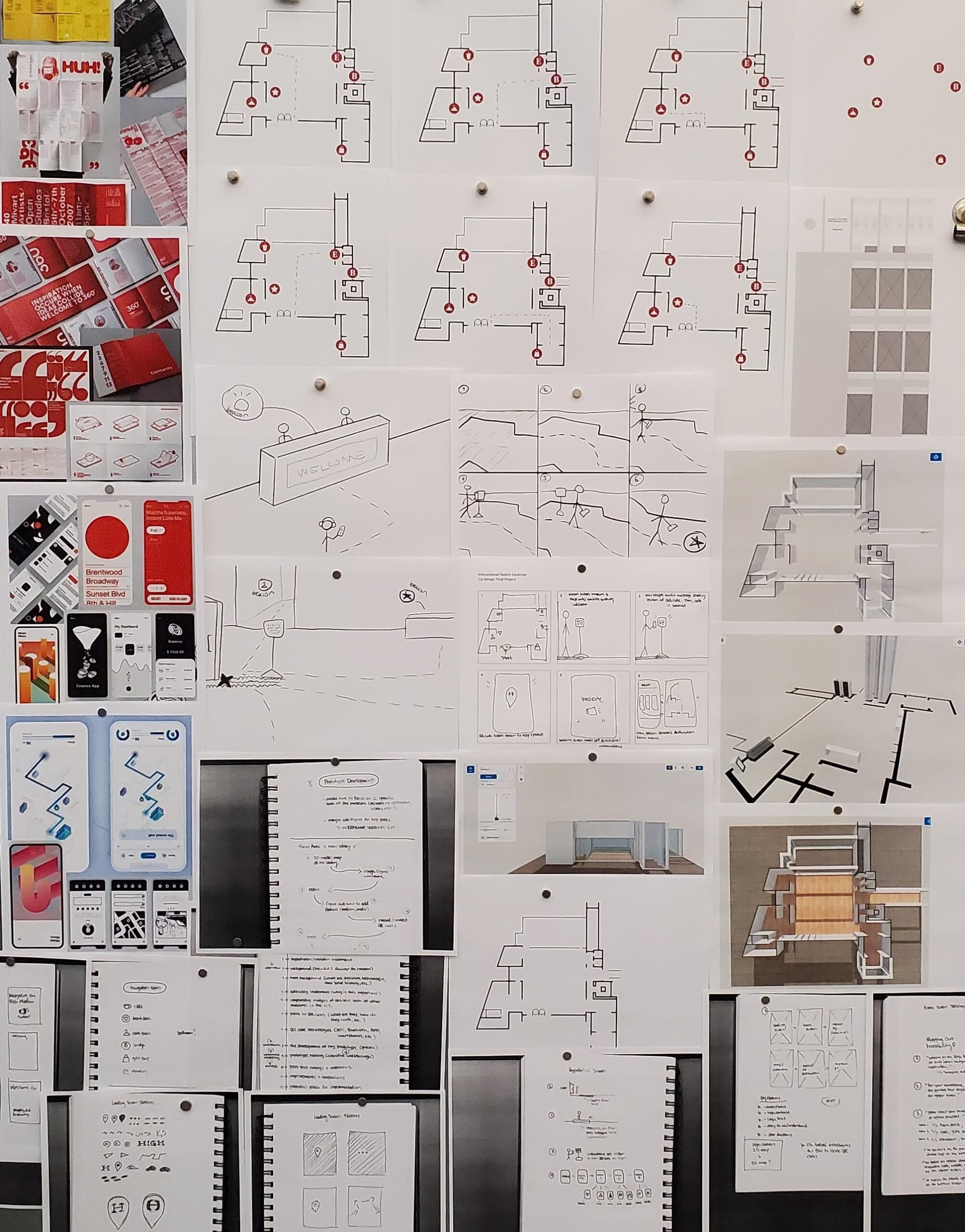
Design process
I began the project by creating mood boards to help envision the look I wanted for the final prototype and poster design. Then, I conducted more in-depth research on how quick response (QR) codes and smartphone applications could be used for navigation inside art museums.
Once I had an idea of how these technologies could function together, I created loose instructional drawings. These instructional drawings functioned to display how I would test the prototype and how the prototype would be used in the actual museum setting.
Once I had an idea of how these technologies could function together, I created loose instructional drawings. These instructional drawings functioned to display how I would test the prototype and how the prototype would be used in the actual museum setting.
Then, I had a meeting with the Senior Coordinator of the Culture Collective at the High Museum to brainstorm more ideas for the project and gather feedback.
After the meeting, I worked on wireframing and prototyping the app in Figma. The Senior Coordinator of the Culture Collective provided me with the museum’s iconography and the lobby map for the prototype. I also made sure to utilize the same typeface and color palette from the previous project for consistency.
After the meeting, I worked on wireframing and prototyping the app in Figma. The Senior Coordinator of the Culture Collective provided me with the museum’s iconography and the lobby map for the prototype. I also made sure to utilize the same typeface and color palette from the previous project for consistency.
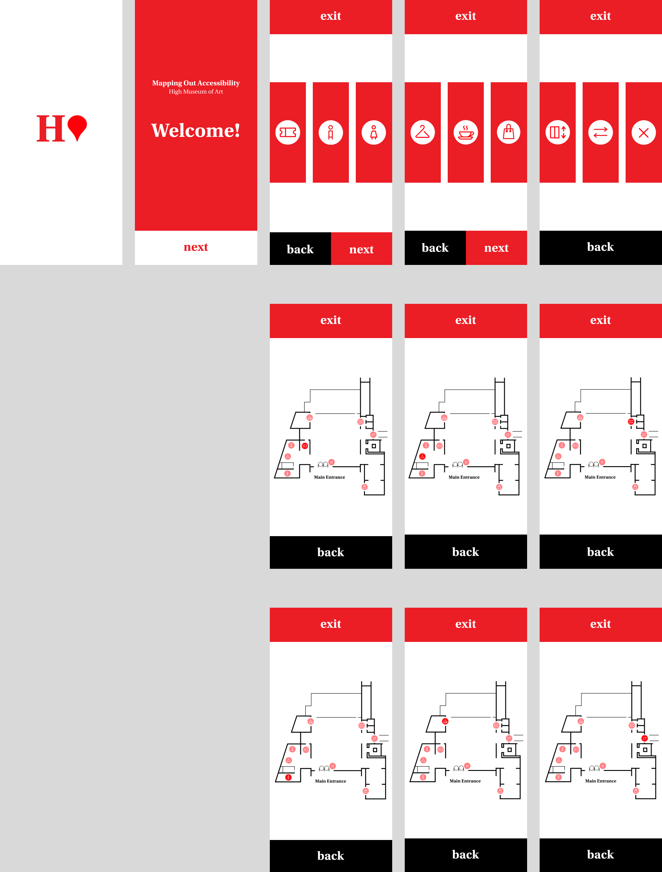
Figma wireframe
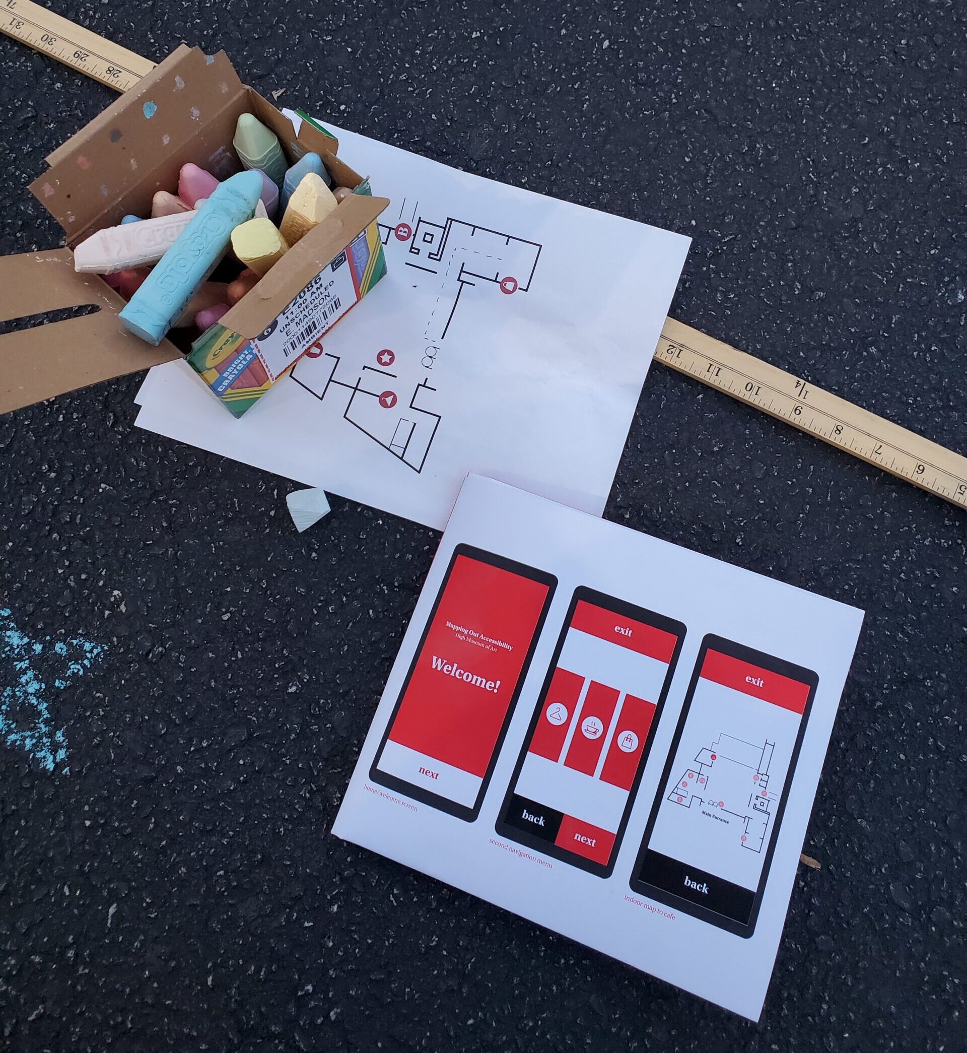
Cognitive walkthrough documentation
Once the app prototype was complete, I conducted a cognitive walkthrough with four participants. The test took place in an empty parking lot with rough guidelines drawn out using chalk. I knew it would be difficult to replicate the lobby’s exact dimensions, so the drawing was not exact for the sake of time.
After the completion of the cognitive walkthrough, each participant was sent a survey in order to measure the prototype’s reliability, efficiency, and ease-of-use.
After the completion of the cognitive walkthrough, each participant was sent a survey in order to measure the prototype’s reliability, efficiency, and ease-of-use.
Finally, I took each step from the process of my project, analyzed the survey results, and began creating the folded poster design.
I wanted the front side of the poster to contain the majority of the research and process in chronological order; and I wanted the back side of the poster to focus more on a mock-up to capture viewers’ attention.
I wanted the front side of the poster to contain the majority of the research and process in chronological order; and I wanted the back side of the poster to focus more on a mock-up to capture viewers’ attention.
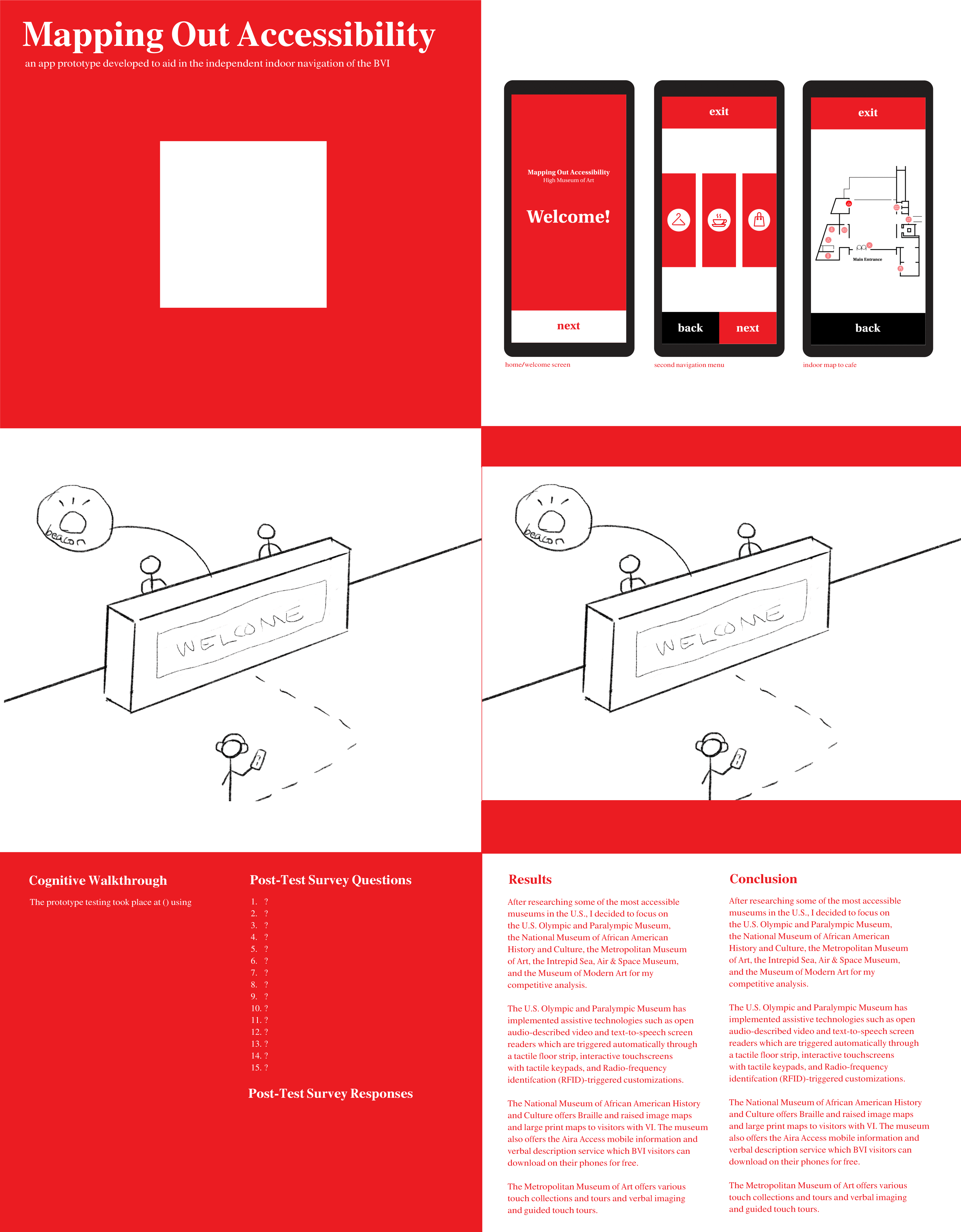
First poster draft (back side)
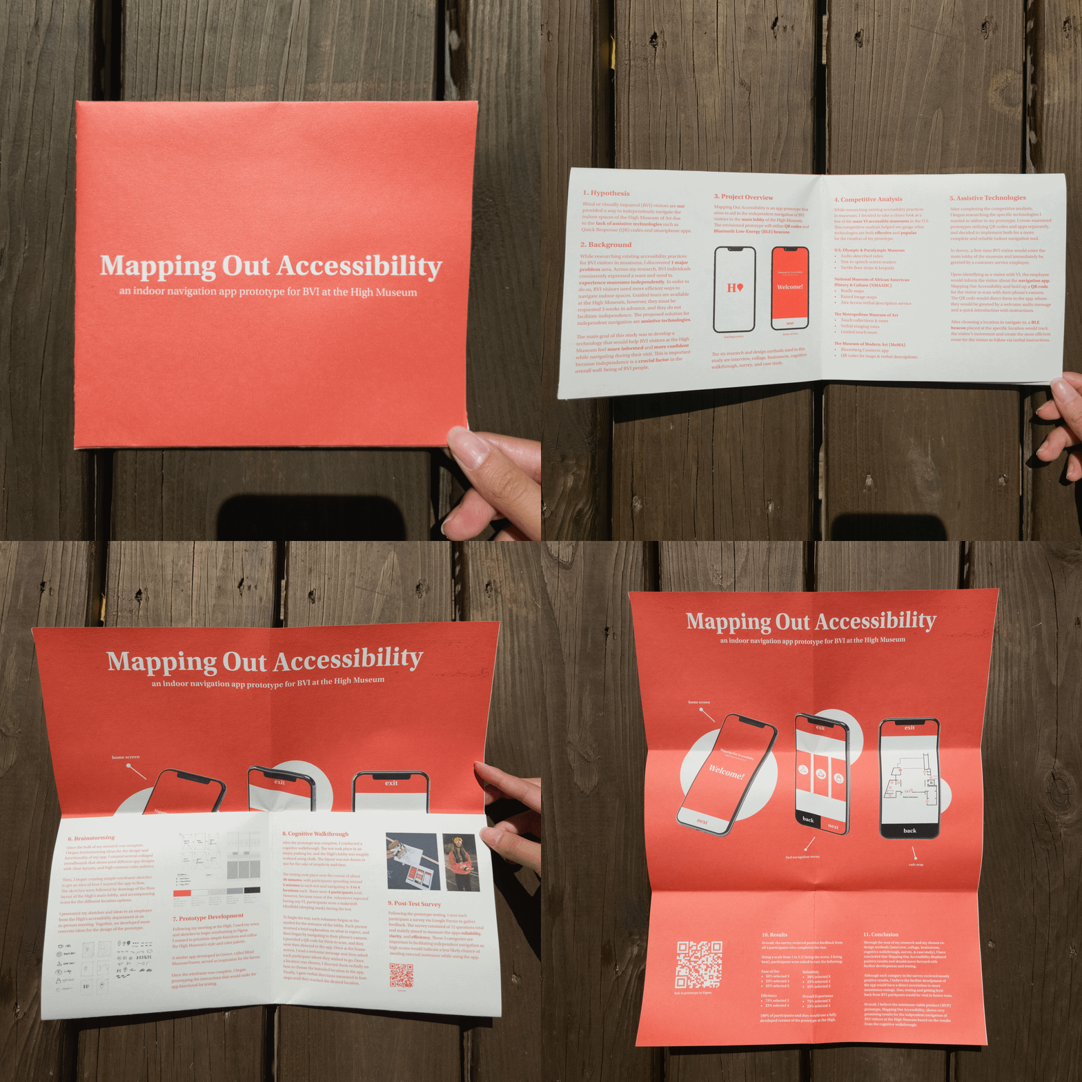
Printed prototype
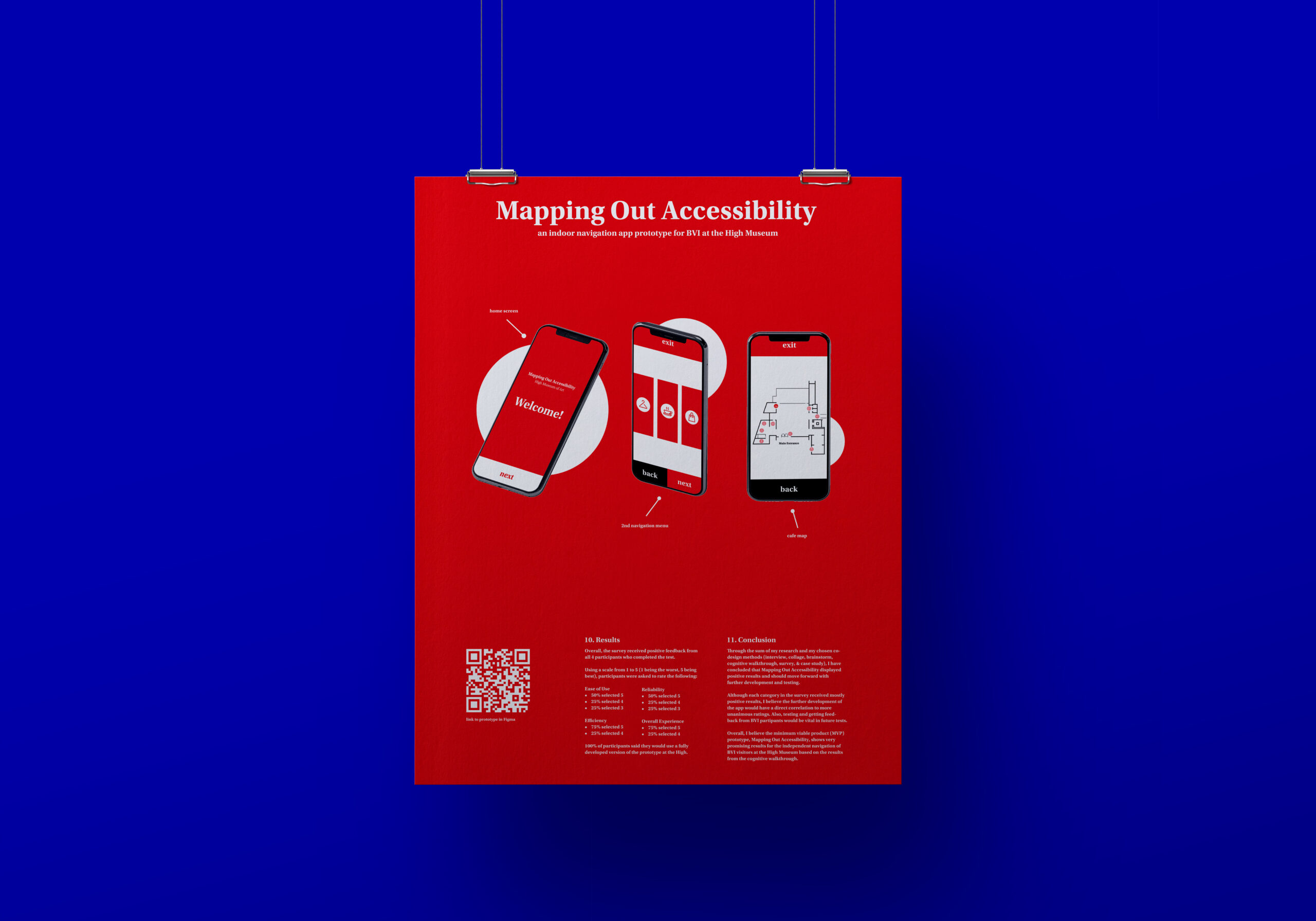
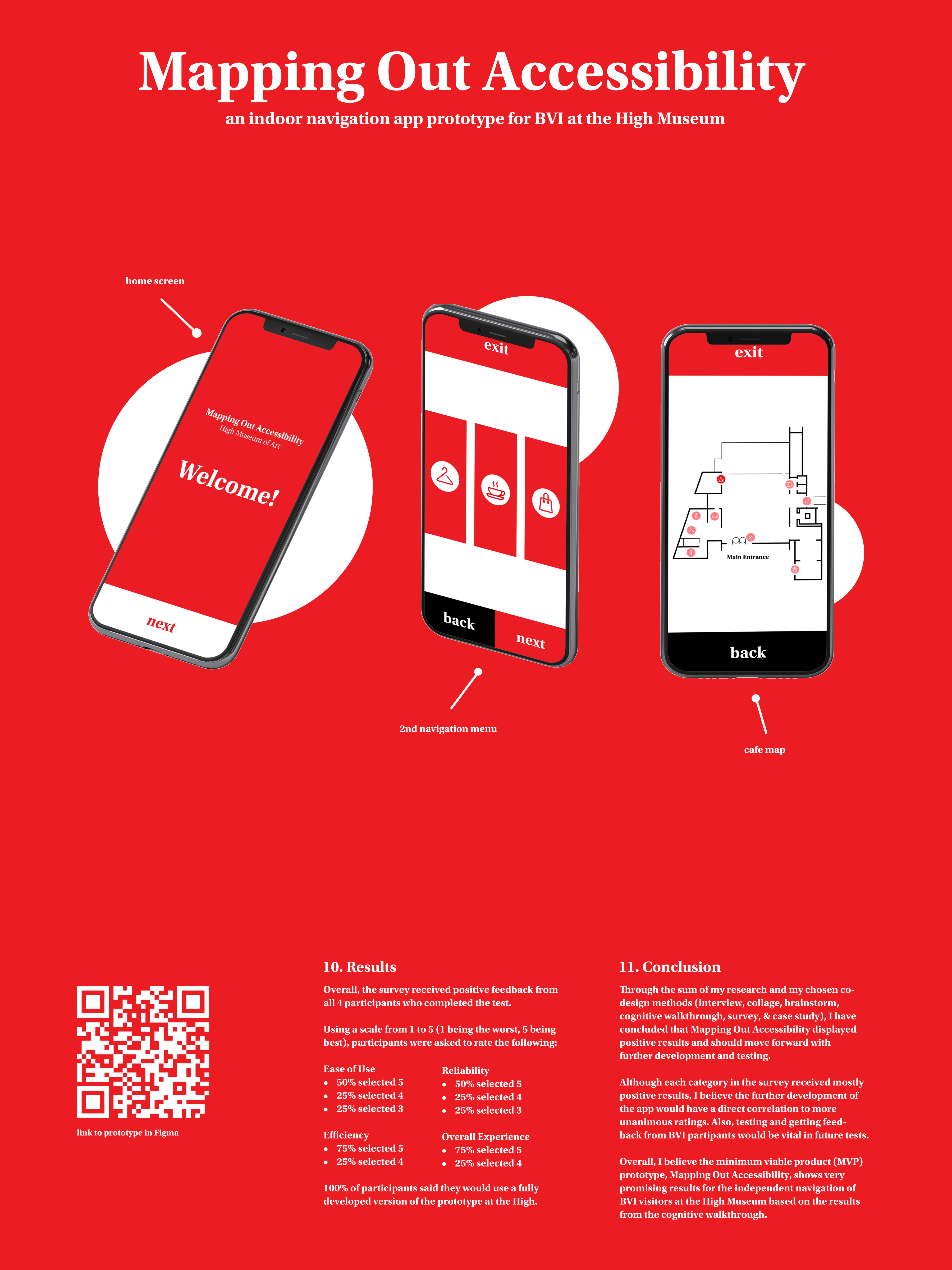
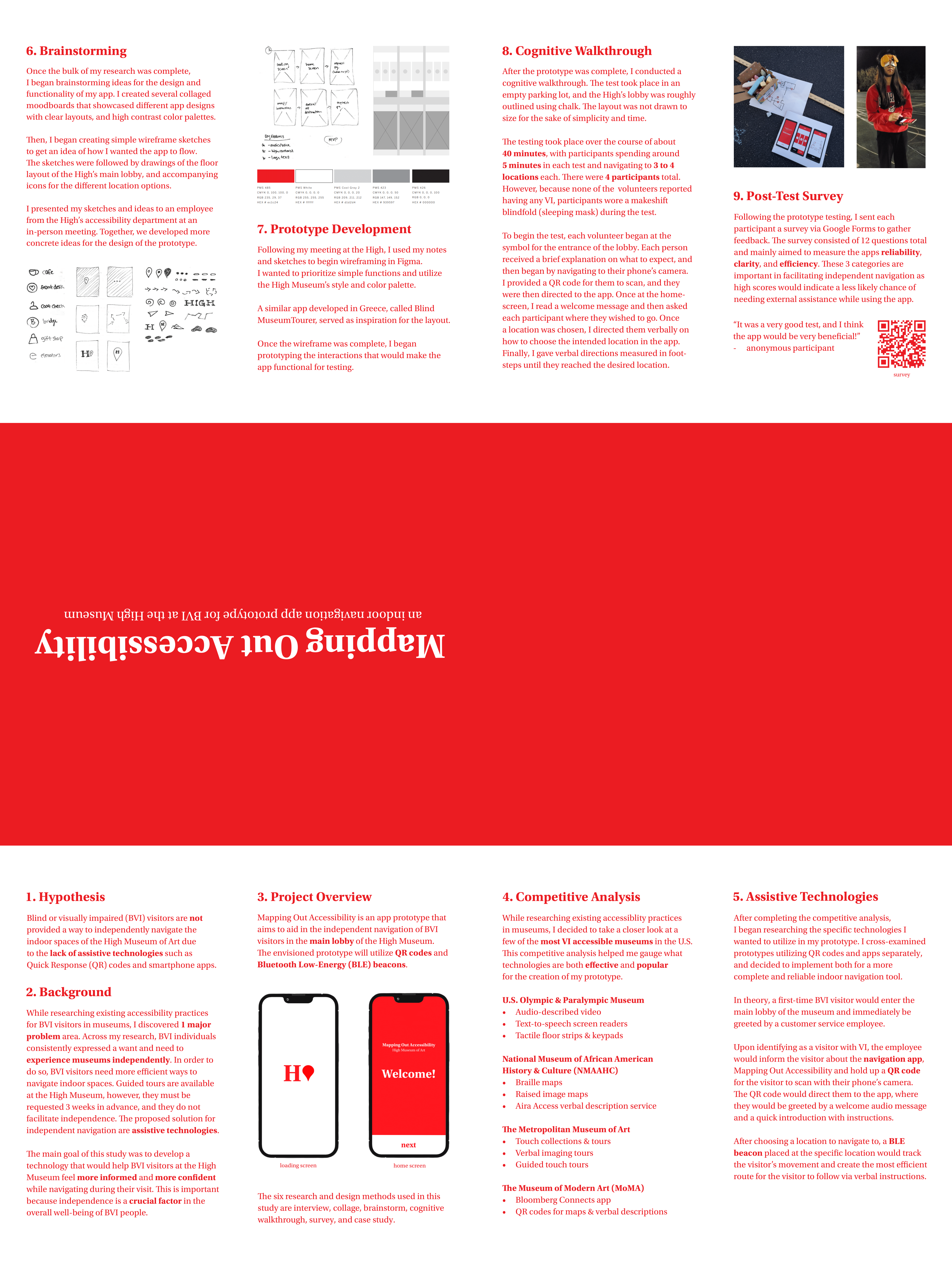
The final poster design features a front side which folds up to act as a booklet and folds out to reveal the poster design on the back.
All of the information is labeled in steps from one to eleven from hypothesis to conclusion and truly gives the viewer a complete and comprehensive understanding of the project.
All of the information is labeled in steps from one to eleven from hypothesis to conclusion and truly gives the viewer a complete and comprehensive understanding of the project.
Final Work
© ELLEN MADSON 2023
