Pale Penguin Cafe
August 2024
Pale Penguin Café is a passion project I completed for a hypothetical café located in Boston’s South End. The main goal of this project was to create a visual identity for this fun and unique café concept.
As a recent college graduate, I have spent a lot of time working and hanging out in cafés. I enjoy the aesthetic environment, being around other people in my age range, and of course, sipping on coffee. So, in order to exercise my design skills and add to my portfolio, I created Pale Penguin.
As a recent college graduate, I have spent a lot of time working and hanging out in cafés. I enjoy the aesthetic environment, being around other people in my age range, and of course, sipping on coffee. So, in order to exercise my design skills and add to my portfolio, I created Pale Penguin.
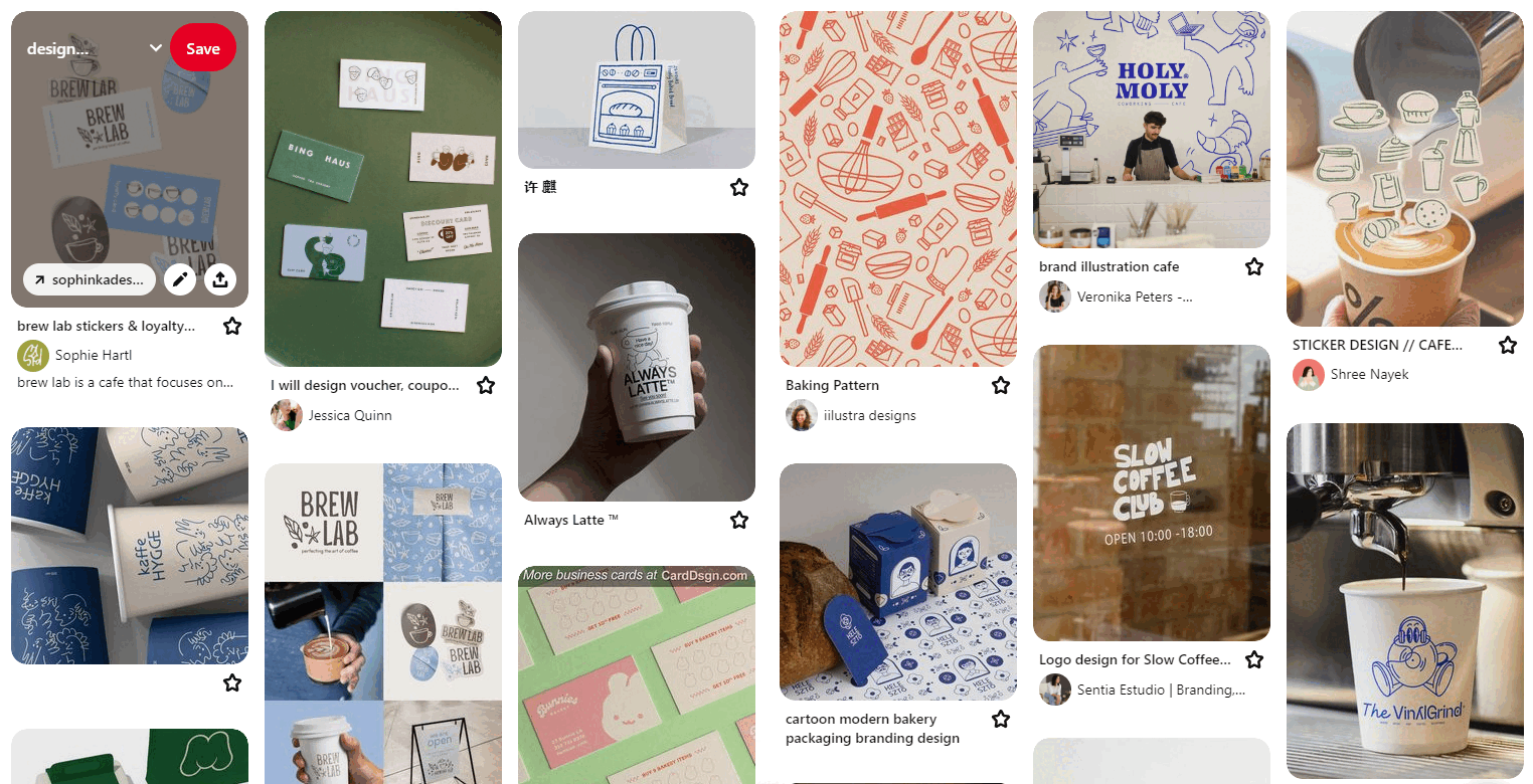
Project inspiration

Initial logo sketches for The Proud Penguin
However, Pale Penguin was originally called The Proud Penguin. Before jumping into any design work, I began by writing a brief that identified essential components of the brand including the brand’s story, values, and personality.
I began with the word penguin because it is the nickname I use to refer to my partner. I also thought a penguin would be a great mascot for a city that experiences colder weather and for a café specializing in iced beverages. I wanted the café to specialize in iced beverages because I favor iced coffee over hot coffee.
Boston was chosen as the location for the café because I plan on moving there soon, and it is a very densely populated city with a large population of college-age students.
The Proud Penguin would target a GenZ audience of primarily students in undergraduate and graduate school and recent graduates entering the workforce. The brand’s personality would be playful, cheerful, friendly, and creative.
However, I was unhappy with the original logo design and decided to revisit the creative brief to make changes. Although the original design was playful and friendly, I felt it looked too childish for the target audience and location. Ultimately, I decided the visual identity should look more mature and refined.
However, I was unhappy with the original logo design and decided to revisit the creative brief to make changes. Although the original design was playful and friendly, I felt it looked too childish for the target audience and location. Ultimately, I decided the visual identity should look more mature and refined.

More logo sketches for The Proud Penguin

Final logo design for The Proud Penguin
While experimenting with different iterations of the logo, I decided to try out different names for the brand to help generate more ideas. Eventually, I landed on Pale Penguin.
Pale Penguin immediately resonated with me as a more reserved and introverted individual who often prefers quiet, minimalistic spaces.
Pale Penguin immediately resonated with me as a more reserved and introverted individual who often prefers quiet, minimalistic spaces.
I chose the typeface Mic 32 New Rounded for the logo design because of its soft and rounded letterforms. The shape of the “n” and “u” also reminded me of the shape of the fur on penguins’ stomachs depicted in The Proud Penguin logo design.
After redesigning the penguin illustration from The Proud Penguin, I also decided to incorporate the piece of fur on top of the penguin’s head into some of the letterforms to give the logo more character and stay consistent.
After redesigning the penguin illustration from The Proud Penguin, I also decided to incorporate the piece of fur on top of the penguin’s head into some of the letterforms to give the logo more character and stay consistent.

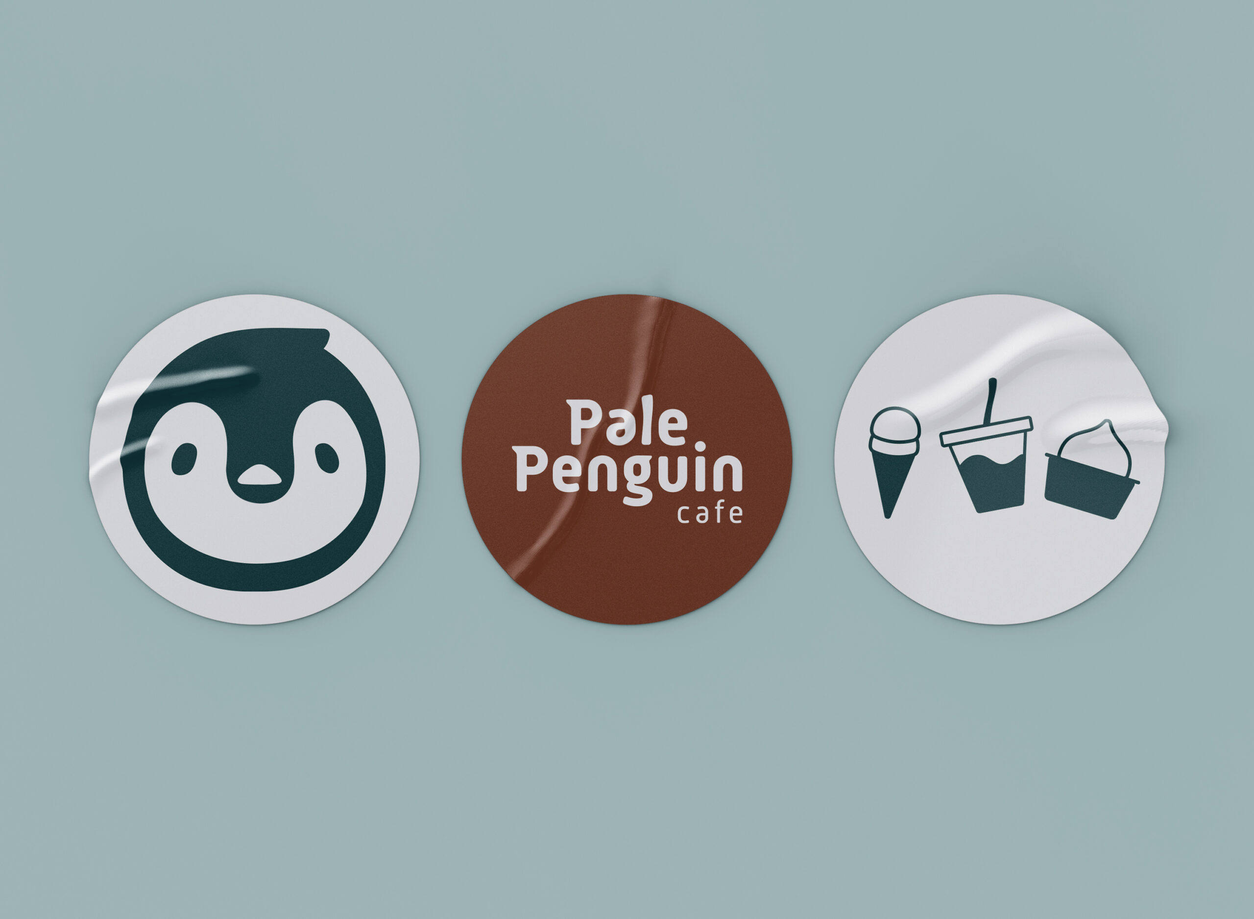
Final penguin design for Pale Penguin
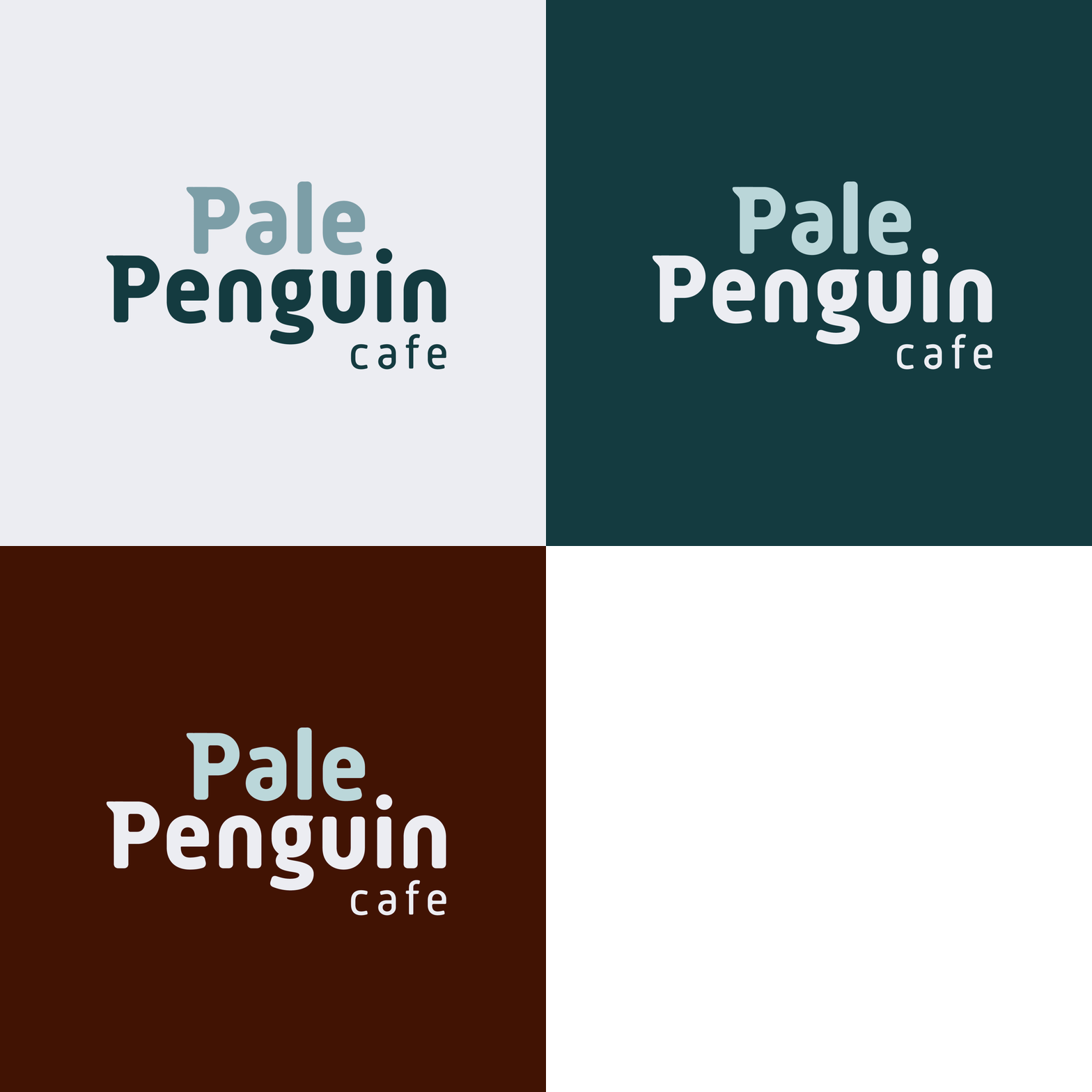
Final primary logo design for Pale Penguin Café
For the brand’s color palette, I searched for Pale Penguin in Adobe Color and combined several color palettes. I already knew that I wanted blue to serve as the primary color because of its association with the cold; however, I specifically chose more muted colors to reflect the definition of pale. I also chose brown as a contrasting color because of its association with coffee.
Final Work
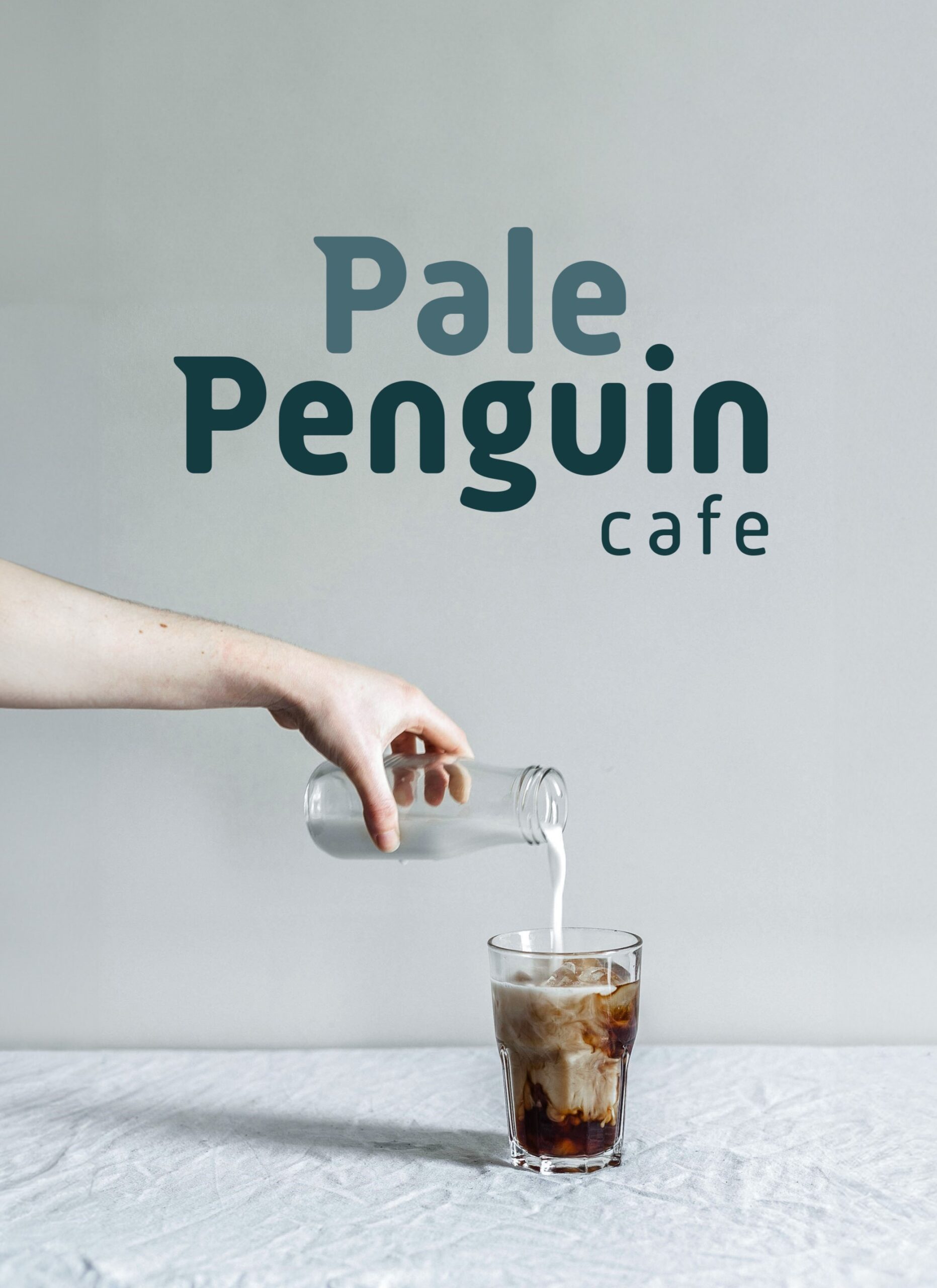
Photo by Alex Lvrs on Unsplash
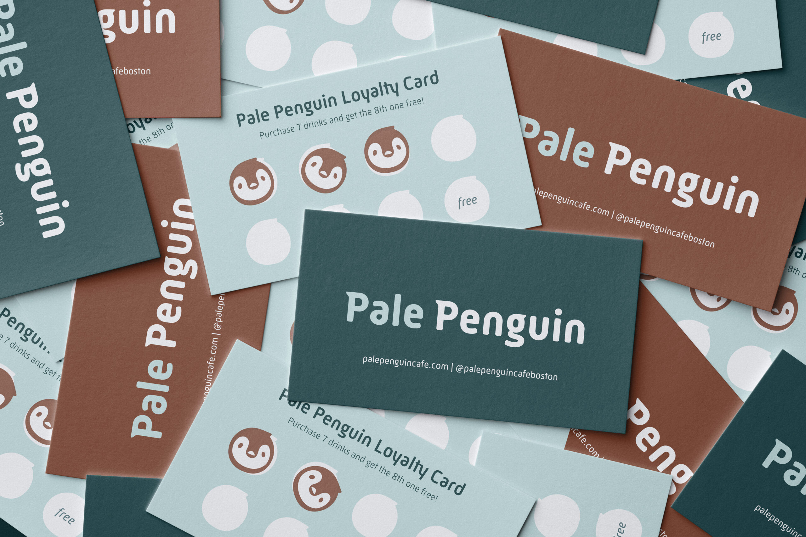
Pale Penguin Café is a café located in Boston’s South End. They are best known for their unique iced coffee flavors and frozen treats. However, they also offer hot beverages, baked goods, and more. The café has a friendly, welcoming, and peaceful vibe, and they value transparency, genuineness, and positivity. All of these attributes are reflected in the brand’s visual identity.
Pale Penguin has distinguished itself from its local competitors by offering premade iced coffee pouches inspired by Korean convenience stores that are convenient for people on the go. These pouches are easily accessible at the front of the café and can be purchased with a complimentary cup of ice at the self-checkout kiosk.
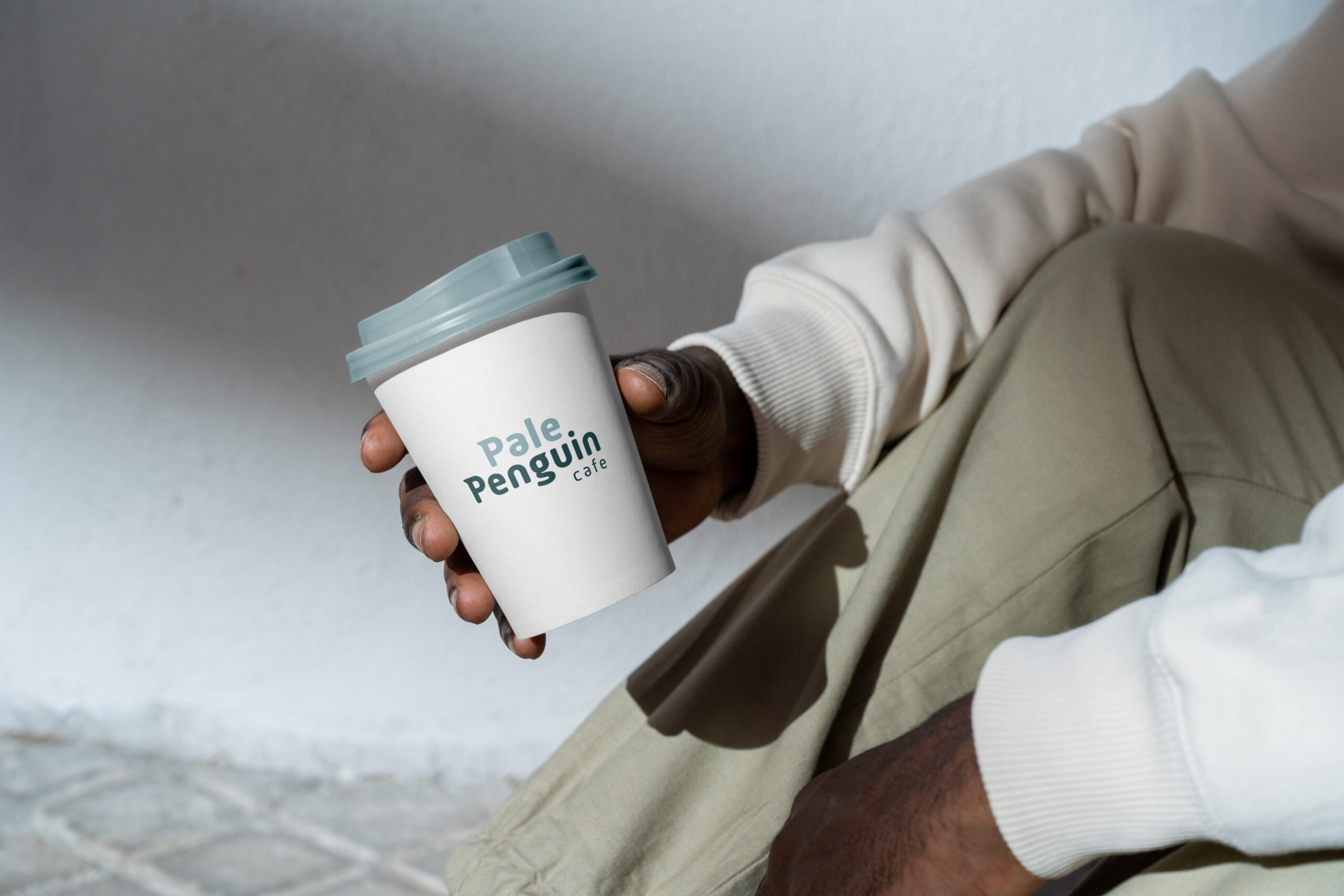

© ELLEN MADSON 2023
